The Good, the bad and the ugly...
Monogramming to Your Best Ability
Today's blog will focus on the importance of a well made monogram design and hopefully clear up some misconceptions about monogramming. The items I chose to highlight all have one common denominator...a good clean photograph. Some are great shots of embroidery well done...and some are just not that great. Let me show you what happened in each example so you can create beautiful embroidery always.
Let me preface this article by saying it is not my intent to hurt feelings, cause dissent or otherwise embarrass. My intent is to educate.
This first sample I call 'well I want it thick'. I am sure if you monogram for others you hear this quite frequently as no one wants a thin washed out monogram on their item...who can blame them? What I repeatedly see happening is that the monogrammer will go into their software and increase the boldness of the font with no regard to stitch quality, see below.
Several sections of the 'S' on the left hand towel show partial fill stitch and partial satin stitch. What has happened is that the designer tried to take this font to a level that it wasn't created for. It is a beautiful font but I am unsure of the source of this particular font, there are a lot of 'fakes' out there on the internet and this may be one of those $1 fonts. Good quality fonts costs more than one dollar ladies, sorry but they do.
Monogram Wizard Plus has a similar font and it has a threshold minimum and maximum (which is a good thing). In layman's terms that means if the designer enlarges the font past a certain threshold the font will automatically convert to a 'filled satin stitch'- which is the correct procedure.
One of two things happened with this design.
- The font was purchased from a source that didn't correctly digitize it for use on napped fabrics (towels)
- The end user decided to bypass their software controls of a maximum satin width of 3/8.
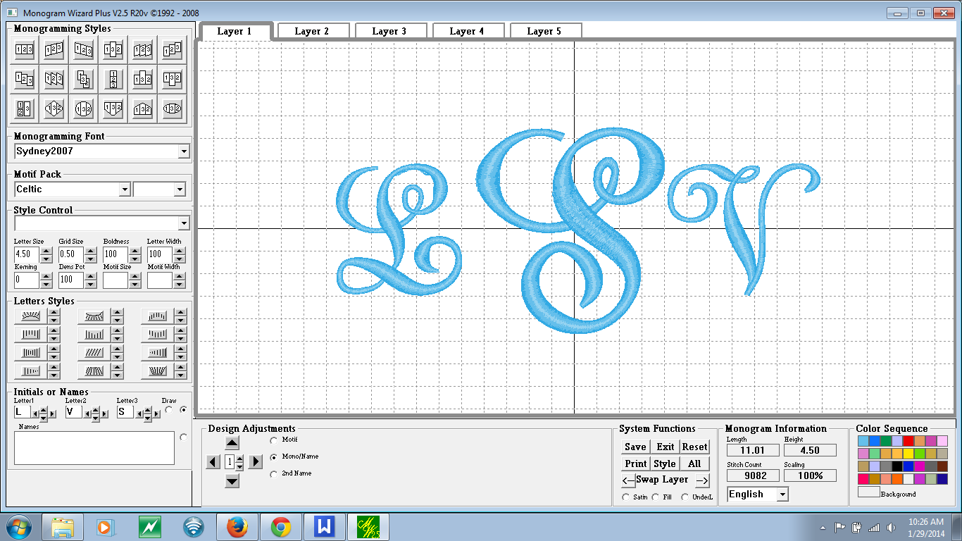
Here is an example of a soft ware attempting to correct what the designer is wanting.
 | ||
| Notice at the widest point of the 's' the design stitching looks more tightly packed, this is because we are very near the maximum width of a proper satin stitch. |


